Telling a Story with Analysis: 3 Visualization Tips for Presenters
These three best practices will help you deliver visualizations that complement your analysis and make the greatest impression on your audience.
- By Fern Halper, Ph.D.
- December 2, 2014
Stories that utilize analysis are potentially everywhere in business. Why are our customers defecting? What can we do to improve operational efficiency? Why are our employees turning over at such a high rate? Once the analysis is done, the question facing the analyst is often how to present the best story to engage the audience, leave an impression, and get them to take action.
Story telling with data has evolved as the technology has evolved. Vendors that provide visualization software for data discovery, for instance, are now providing tools as part of the suite that might include storyboarding, collaboration, interaction, and dynamic updating. Sophisticated graphics such as maps and heat maps are increasingly included in these solutions. These tools provide analysts a canvas for telling a visual story from their analysis. In some instances, their story might be a living story that members of an organization continue to update regularly. TDWI refers to this kind of storytelling as "modern storytelling."
Regardless of whether you are working with new tools that enable ongoing stories from your analysis or are simply presenting the results of one-time analysis to your executive team, there are best practices to help you with the visualization part of your story.
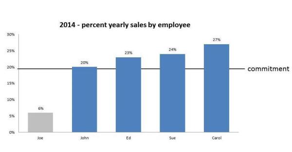
Here are three tips to get you started. The principles are illustrated in the graphic below.
Best Practice #1: Less can be more.
Remember, the idea behind the story is to engage your audience and make the story memorable and actionable. You aren't going to do that if you inundate your audience with too many facts and figures. Although it may be tempting to show everyone how much work you've done in your analysis, the reality is that too much information can overload the brain, resulting in an audience that remembers nothing. Don't include every chart you've created from your analysis when you present your story. Pick your charts wisely. Use those that provide key messages of your story. Break up presentations a bit with other kinds of slides if needed.
Best Practice #2: Make your presentation easy to understand.
You also want each chart to be easy to understand and to be able to stand on its own. There are a few principles at work here. First, don't clutter your canvas with too much data. Make sure the important points jump out at the audience. It can make sense to annotate the chart to highlight important points, or use two or more colors to highlight the points of interest.
For example, in our sample chart, we can quickly see that Joe is far behind the other salespeople because that fact is highlighted in gray. Use a tool that shows how your illustration will look to a colorblind person.
Second, you want to answer the "Why do I care?" question in your chart. For instance, you might include a title for your churn talk that reads, "Customer churn at a five-year high." In our sample illustration, it is clear that Joe isn't meeting his yearly sales commitment.
Best Practice #3: Don't mislead your audience.
At the same time you want your graphic to convey the message, you must maintain its integrity. You need to think about the Y axis. For instance, if you're plotting sales per year, it might be tempting to start with a high number, as opposed to 0 on the Y axis so that the results look like they are growing rapidly. However, that might actually mislead audience members who aren't clued into the Y axis; all they notice is the growth rate. Starting the axis at 0 will likely provide a truer representation of what is actually happening.
If you're interested in learning more about story telling with data, consider attending TDWI's conference in Orlando, December 7-12 -- that's just around the corner. It includes an entire track about storytelling. There is even a new course designed specifically about storytelling with data.